🧠 Design Mistakes to Avoid When Using Random Colors
When you’re working on a website or app, colors play a massive role in how users feel and interact. A perfect color palette can make your design memorable, while poor color choices can ruin the whole experience. Many designers love experimenting with random colors, especially using tools like the Random Color Generator.
But without a solid understanding of color palette mistakes, random colors can easily turn your sleek design into a confusing mess.
In this post, we’ll explore the most common color palette mistakes designers make, and how to avoid them while using random colors effectively.

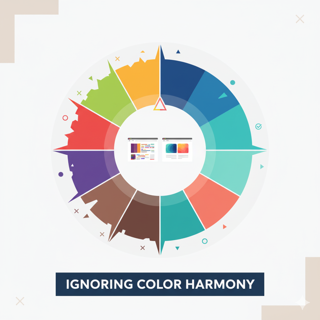
🎨 1. Ignoring Color Harmony
One of the biggest color palette mistakes is ignoring color harmony. Random colors can be exciting, but if they don’t complement each other, your design loses visual balance.
Colors that clash can distract users from your content and reduce readability. Every color has emotional value, red excites, blue calms, green balances, and random combinations can create emotional confusion if not aligned.
✅ Tip:
Use tools like the Random Color Generator to experiment, but stick with harmonies like analogous, complementary, or monochromatic color schemes.
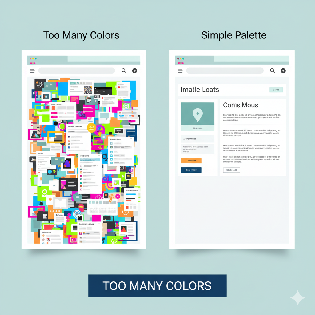
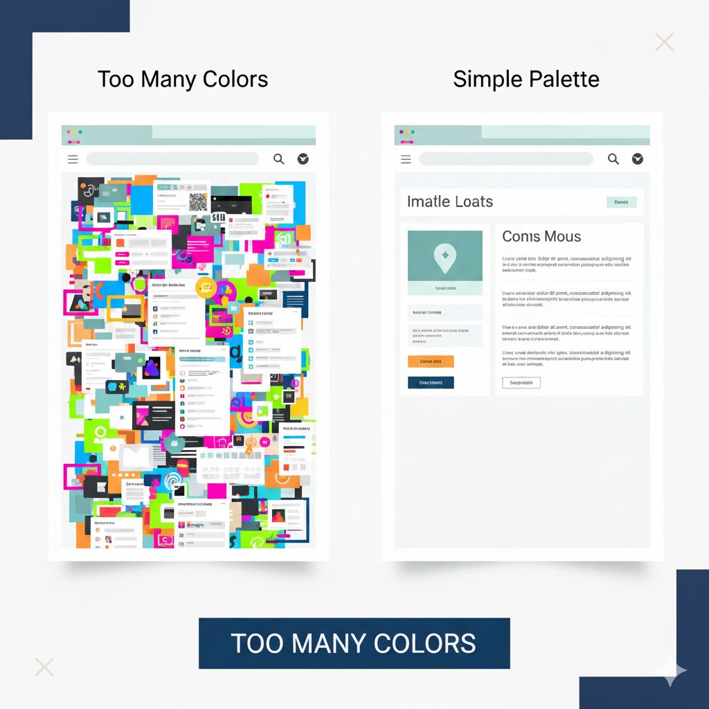
⚖️ 2. Using Too Many Colors
It’s tempting to go wild with a variety of colors, especially when you find a new random palette. But using too many colors is another major color palette mistake.
Design works best when it feels cohesive. Using 3–4 colors that balance well is often more powerful than 10 that compete for attention. Too many random colors can make your website look chaotic, not creative.
✅ Pro Tip:
Start with one dominant color, one accent color, and a neutral background. Then adjust using a random color generator to find shades that fit your theme.
🌈 3. Ignoring Color Contrast
Contrast helps users read text and see visual hierarchy clearly. Many designers overlook this, making it one of the most common color palette mistakes in web design.
If your background and text colors are too similar, visitors will struggle to read your content. On the flip side, extremely high contrast (like neon green text on a red background) can be harsh on the eyes.
✅ Tip:
Always test your color contrast ratios. Tools like WCAG contrast checkers or even your random color generator tool can help ensure proper balance between readability and design.
💡 4. Not Considering Accessibility
Accessibility should never be an afterthought. A design that looks great to you might be unreadable to users with color vision deficiencies.
This is one of the subtle yet serious color palette mistakes. If you use random colors without considering accessibility, your design might unintentionally exclude part of your audience.
✅ Pro Tip:
Choose color palettes that remain distinguishable in grayscale. Test your design with accessibility simulators and adjust your colors for everyone’s visibility.
🎭 5. Forgetting Brand Identity
When using random colors, designers often lose sight of their brand’s voice. This is another crucial color palette mistake, using random shades that don’t match the brand’s tone.
For example, a legal firm using playful neon colors might confuse users, while a gaming site using muted grays may feel lifeless.
✅ Tip:
Use the Random Color Generator to explore new ideas, but always refine your palette so it aligns with your brand’s personality.

🧩 6. Overlooking White Space
Colors are powerful, but too much of them, with no space to breathe, can overwhelm users. Designers often make the color palette mistake of filling every area with color.
White space helps users focus on key elements and makes the design look cleaner and more modern.
✅ Tip:
Let your colors “breathe.” If you’re using vibrant random colors, balance them with enough white or neutral backgrounds for visual comfort.
🎯 7. Not Testing on Different Devices
Colors can appear differently on monitors, mobile screens, and tablets. Many designers forget to check color consistency, a hidden color palette mistake that affects real-world performance.
A bright coral shade might look perfect on desktop but turn dull on mobile.
✅ Tip:
Preview your design on multiple devices before finalizing. Random colors can shift tone depending on brightness and display, so make sure your palette stays consistent.
🧠 8. Forgetting Emotional Impact
Every color triggers emotion. When you use random colors blindly, you risk sending mixed messages. This emotional disconnect is one of the most subtle color palette mistakes professionals make.
For instance, using bright red for a health app might create anxiety instead of trust.
✅ Pro Tip:
Before finalizing, ask: “What emotion should my design evoke?” Then use random color combinations that support that mood, not contradict it.
🎨 9. Neglecting Neutral Colors
Not every design element needs a pop of color. Forgetting to include neutral tones like gray, beige, or white is another color palette mistake that disrupts balance.
Neutral colors help support bold shades and guide users’ attention. Without them, your random color-based design can feel overwhelming or cluttered.
✅ Tip:
Use neutral backgrounds to anchor bright colors. This contrast helps your palette look more professional and focused.
🔍 10. Relying Only on Random Selection
Random colors can spark creativity, but relying entirely on them without design sense is a common color palette mistake.
Use randomness for inspiration, not as your final decision. Combine it with strategy: think about contrast, emotion, brand tone, and readability.
✅ Pro Tip:
Experiment with the Random Color Generator to get inspiration, then fine-tune each color for harmony and purpose.

❓ FAQs
Q1: What are common color palette mistakes designers make?
A: Overusing colors, ignoring contrast, neglecting accessibility, and not aligning colors with brand identity are the most common mistakes.
Q2: How can I fix poor color combinations in my design?
A: Use a Random Color Generator to test new combinations, focus on harmony (complementary or analogous colors), and keep enough white space.
Q3: Can random colors ever work in minimalist design?
A: Yes, but moderation is key. Combine random shades with neutrals and keep your palette limited to 2–3 main tones.
Q4: Why is contrast important in web design?
A: Proper contrast improves readability, accessibility, and helps guide user attention effectively.
Q5: How can I test if my color palette is accessible?
A: Use online contrast checkers or preview your design in grayscale mode to ensure all users can distinguish elements.
✅ Related Posts:
- Top 10 Ways to Use Random Colors in Web Design
- Best Random Color Palettes for Minimalist Websites
- 🌈 The Psychology of Color in Web Design
💬 Final Thoughts
Using random colors can bring spontaneity and fun into your design process, but without balance and awareness, they can lead to color palette mistakes that harm user experience.
Remember:
- Color harmony builds visual rhythm.
- Contrast ensures readability.
- Accessibility and brand alignment strengthen connection.
So the next time you’re crafting a new layout or experimenting with a Random Color Generator, use it as a creative assistant, not the decision-maker.
Your design should tell a story, not just show random colors.
🎨 Want to Experiment with Colors the Right Way?
Avoid color palette mistakes and discover endless creative combinations using our free Random Color Generator. Perfect for web and graphic designers.
🎨 Try Random Color Generator


