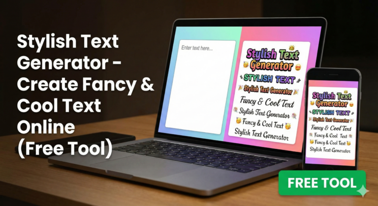
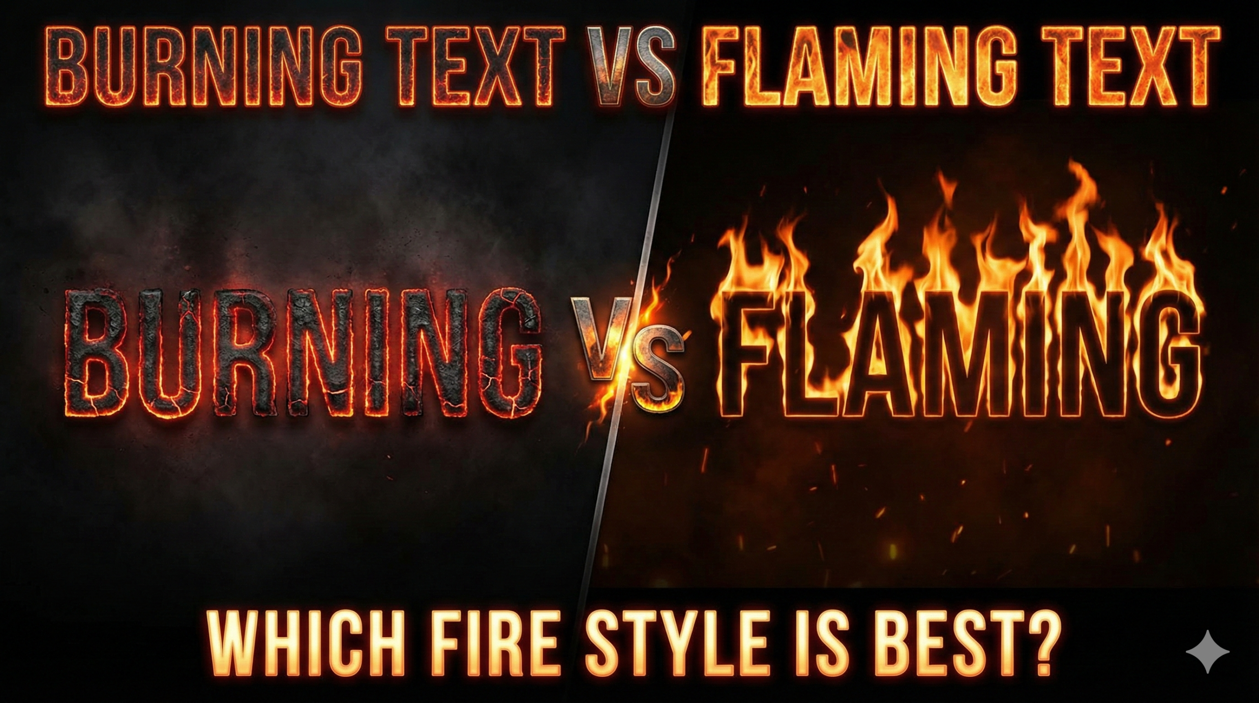
Everyone loves cool text effects. Whether you are making a logo for a game, a thumbnail for YouTube, or a cool school project, adding fire makes everything look exciting. However, there is one common question that many designers ask: what is the difference between burning text vs flaming text?
Are they the same? Or are they completely different styles? In this simple guide, we will explore the world of fire typography and help you decide which one looks better for your needs. We will compare the colors, the shapes, and the best places to use them.
By the end of this post, you will know exactly which fire text style is better for your specific design. Let’s dive into the hot debate of burning text vs flaming text.
In this guide, we will break down everything. We will look at the fire text styles comparison, show you where to use them, and help you decide which one fits your style. Whether you need a burning text effect for a scary vibe or a flaming text effect for a high-energy logo, we have got you covered.
What is the Main Difference?
Before we choose a winner, we need to understand what these two styles actually are. Many people think a fire text generator produces the same result for both, but there is a slight visual difference.
1. The Burning Text Effect
When you use a burning text effect, it looks like the letters themselves are being consumed by heat. Imagine a piece of wood or paper that has been in a fire for a long time. It glows red and orange from the inside.
- Look: The edges are often charred (black).
- Feel: It feels intense, slow, and hot.
- Best For: Dramatic scenes or scary movie posters.
A burning font focuses more on the glow inside the letter rather than big flames coming off the top. It looks like the burning letters text is made of hot lava or coal.
2. The Flaming Text Effect
On the other hand, a flaming text effect is all about motion and energy. Here, the letters look like they are on fire, but the letters themselves might still be readable and solid. The main feature is the tall flames rising up from the words.
- Look: Bright yellow and orange flames going upward.
- Feel: Energetic, fast, and loud.
- Best For: Action games and racing car designs.
So, when we compare burning text vs flaming text, remember that “burning” is about the heat inside the object, while “flaming” is about the fire surrounding the object.
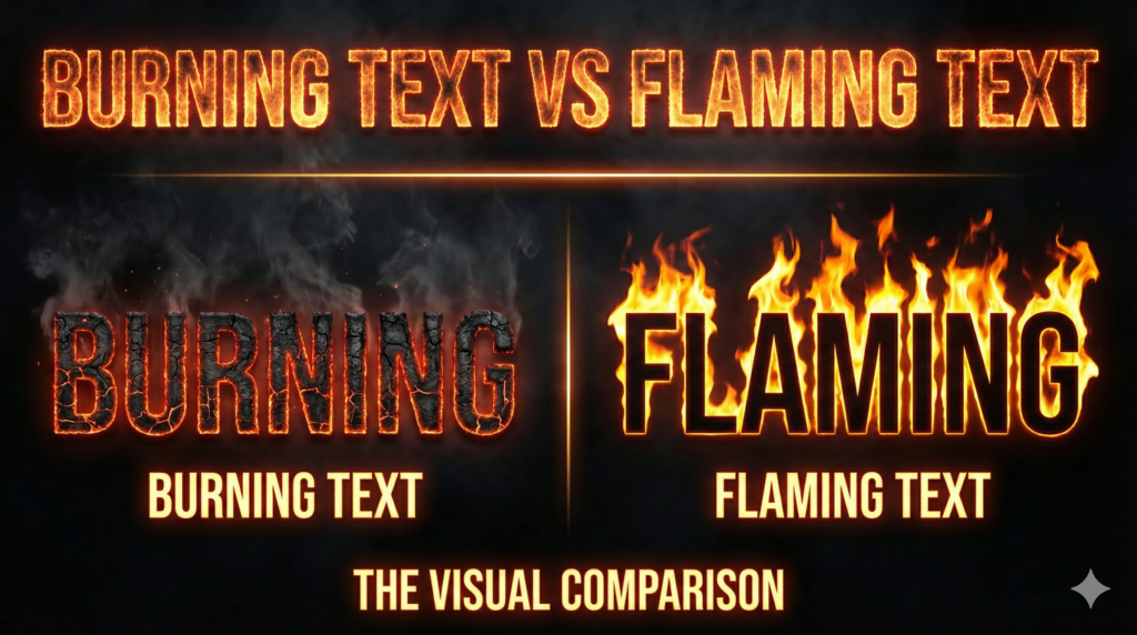
Burning Text vs Flaming Text: The Visual Comparison
Now, let’s get into the details. When you are designing, you have to pick the right style. Let’s break down the burning text vs flaming text comparison based on three important things: Visibility, Style, and Vibe.
Visibility and Readability
If people cannot read your text, your design fails.
- Flaming Text: Sometimes, if the flame text style has too much fire around it, the letters get hidden. The flames can cover the shape of the alphabet.
- Burning Text: Usually, a burning text design keeps the shape of the letter very clear because the effect is inside the letter, not just around it.
If you need your text to be read very quickly, the burning text effect might be slightly safer. However, if you want to grab attention from far away, the bright colors of a flaming font work best.
Color Differences
- Burning Styles: Use dark reds, deep oranges, and blacks (charcoal colors).
- Flaming Styles: Use bright yellows, neon oranges, and sometimes white (hottest part of the fire).
When choosing fire text vs flame text, think about your background. If you have a dark background, both look great. If you have a light background, burning text vs flaming text can be tricky, but burning text usually stands out better because of the dark edges.
Where to Use These Styles?
Choosing the right style depends on what you are making. Here are some common places where people use these effects and which fire text style is better for each.
1. YouTube Thumbnails
This is a very popular category. When making flaming text for youtube thumbnails, you want high energy. You want the viewer to click immediately. Because flaming text is brighter and bigger, it usually wins here. It creates a sense of hype and excitement.
However, if you are doing a mystery video or a horror storytelling video, the burning text vs flaming text choice changes. For scary topics, the burning text effect looks much better because it feels dangerous.
Learn how to design better YouTube Thumbnails here
2. Gaming Profiles and Logos
Are you looking for burning text for gaming names? Gamers love fire.
- If your game is a fast shooter or racing game, go for the flaming letters design. It represents speed.
- If your game is a survival game or a dark RPG, the burning font fits perfectly.
3. Social Media Posts
When posting on Instagram or TikTok, you want a text on fire effect that pops. The burning vs flaming text for thumbnails rule applies here too. Bright flames attract eyes, but burning embers tell a story.
How to Create These Effects?
You don’t need to be a professional artist to make these. There are many ways to get these looks.
Online Generators
The easiest way is to use a free online tool. You can search for a fire text generator. These tools let you type your name and instantly see the burning text vs flaming text result. You can switch between fire text styles comparison modes to see which one you like.
Graphic Design Software
If you use Photoshop or Canva, you can create a custom burning text design.
- For Burning: Use texture overlays that look like cracked lava. Add an “Inner Glow” effect.
- For Flaming: Use a brush tool to paint flames on top of the letters. Use the “Smudge” tool to pull the colors up like fire.
The burning text vs flaming text creation process is different in software. Burning text relies on textures, while flaming text relies on brush strokes and motion blur.
Read our guide on Best Graphic Design Tools for Beginners
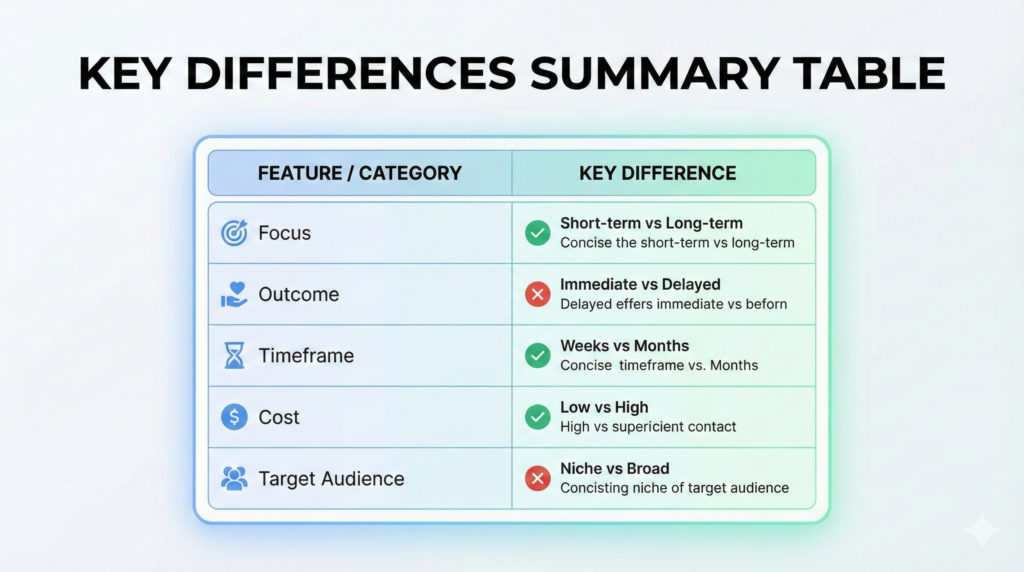
Key Differences Summary Table
To help you understand the burning text vs flaming text difference quickly, here is a simple table:
| Feature | Burning Text | Flaming Text |
| Main Focus | Heat inside the letter | Fire outside the letter |
| Colors | Red, Dark Orange, Black | Yellow, Bright Orange, White |
| Best For | Horror, Survival, Mystery | Action, Racing, Hype |
| Readability | High (Clear shapes) | Medium (Flames can distract) |
| Vibe | Slow burn, Intense | Fast, Explosive |
Common Mistakes to Avoid
When using these styles, avoid these common errors:
- Overdoing the Effect: Don’t put too much fire. If you can’t read the word, the design is bad. This is true for both burning text vs flaming text.
- Wrong Background: Never put fire text on a red background. It will disappear. Use black or dark blue backgrounds for the best fire typography results.
- Mixing Styles: Try not to mix a burning font with a water effect. It looks messy. Stick to one theme.
Related Posts
- Fire Text Generator (Copy & Paste)
- What Is a Fire Text Generator? A Simple Guide & How It Works
- Fancy Text for Gaming Names
- Stylish Gaming Names
- Gamer Tag Generator
FAQs (Frequently Asked Questions)
Here are some common questions people ask about burning text vs flaming text and design.
1. What is the main burning text vs flaming text difference?
The main difference is the visual focus. Burning text looks like the letters are turning into ash with an internal glow, while flaming text looks like fire is rising up from the letters.
2. Which is better, burning vs flaming text for thumbnails?
Generally, flaming text for youtube thumbnails is better because it is brighter and catches the eye faster. However, for horror videos, burning text is better.
3. Can I use these effects for free?
Yes! There are many free tools online. Just search for a fire text generator or a burning text generator.
4. Is burning text for gaming names popular?
Yes, burning text for gaming names is very popular, especially for clans and teams that play survival or war games.
5. How do I make the text on fire effect in Canva?
In Canva, you can search for “Fire Letters” in the Elements tab. You can drag and drop these letters to create your word.
6. Which style is easier to read?
In the burning text vs flaming text comparison, burning text is usually easier to read because the outline of the letter stays solid.
7. Can I use these fonts for school projects?
Yes, using a fire text style or burning letters text makes presentation titles look very cool and creative.
Final Thoughts
So, who wins the battle of burning text vs flaming text? The answer depends on your project.
If you want something that looks dangerous, hot, and intense, go with the burning text effect. It gives a serious and dramatic vibe. But, if you want something that looks fast, energetic, and exciting, the flaming text effect is your best choice.
Both styles are amazing examples of fire typography. We hope this fire text styles comparison helps you choose the perfect look for your next design. Whether you choose the deep glow of burning coals or the bright rise of flames, your text is sure to look hot!
Burning Text vs Flaming Text | Test Both Styles Instantly
Still deciding which one looks better? Create burning and flaming text in seconds with our free fire text generator.
Compare Fire Text Styles