
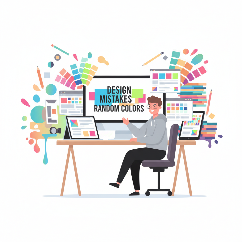
🧠 Top 9 Design Mistakes Using Random Colors
Color is one of the most powerful tools in design it defines mood, emotion, and brand personality. But when designers rely too heavily on random colors, even the most creative projects can turn into visual chaos. Understanding design mistakes using random colors is crucial for building websites, interfaces, and visuals that are not only eye-catching but also coherent and professional.
In this article, we’ll explore the most common color palette design mistakes, how random colors can ruin your layout if not used strategically, and how tools like a Random Color Generator can actually help if you know how to use them the right way.
🎨 Why Designers Use Random Colors
Random colors often represent freedom and experimentation. Many designers, especially beginners, love using random color schemes to explore unique combinations or test unconventional palettes. With a random color generator, you can instantly generate endless hues and shades, making the creative process feel effortless.
However, random doesn’t mean careless. The key is to control randomness with intention. When colors don’t align with brand identity, accessibility, or visual balance, your design may lose its impact. That’s where most design mistakes using random colors begin.
9 Design Mistakes Using Random Colors
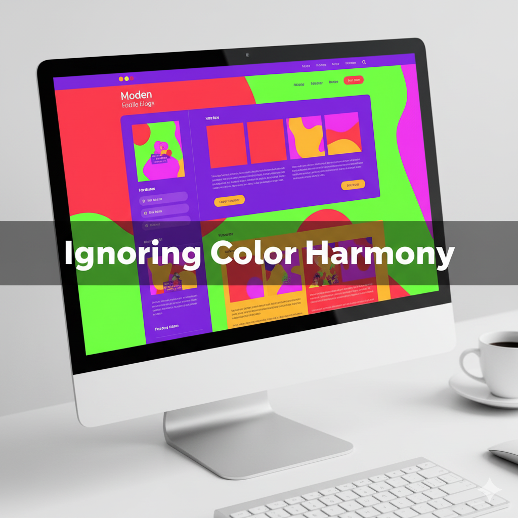
Mistake #1: Ignoring Color Harmony
One of the biggest UI/UX color design mistakes is skipping harmony. A website that uses random bright colors without balance can look confusing and unprofessional.
Design harmony relies on relationships between colors, complementary, analogous, triadic, or monochromatic. If you mix random hues without following a system, the visual flow breaks. For example, pairing neon green with deep maroon may draw attention but can also strain the eyes.
Fix it:
Before finalizing your palette, test combinations using color theory principles or online palette tools. The random color generator can help by generating sets of shades, but make sure you refine them for harmony.
Mistake #2: Overusing High Saturation
Bright and saturated colors look energetic but can quickly overwhelm viewers when overused. Many designers fall into the trap of applying multiple bold colors randomly, thinking it adds excitement. Instead, it creates bad color combinations in design that distract from the message.
Fix it:
Use saturated colors for highlights, buttons, or call-to-action areas only. Keep the background and secondary sections neutral. This maintains contrast and helps the main focus stand out clearly.
Mistake #3: No Connection to Brand Identity
When colors are chosen without a brand story in mind, the entire design feels disconnected. Your color choices should reflect your tone, playful, minimal, luxurious, or eco-friendly. Random colors that clash with brand values cause confusion and reduce recognition.
For example, a healthcare website using flashy red and black may look aggressive instead of trustworthy. That’s one of the common design mistakes using random colors that can destroy visual credibility.
Fix it:
Create a color palette that aligns with your brand voice. If you use a random color generator, start by locking a primary brand color, then generate secondary or accent colors around it. This way, randomness works within your brand system.
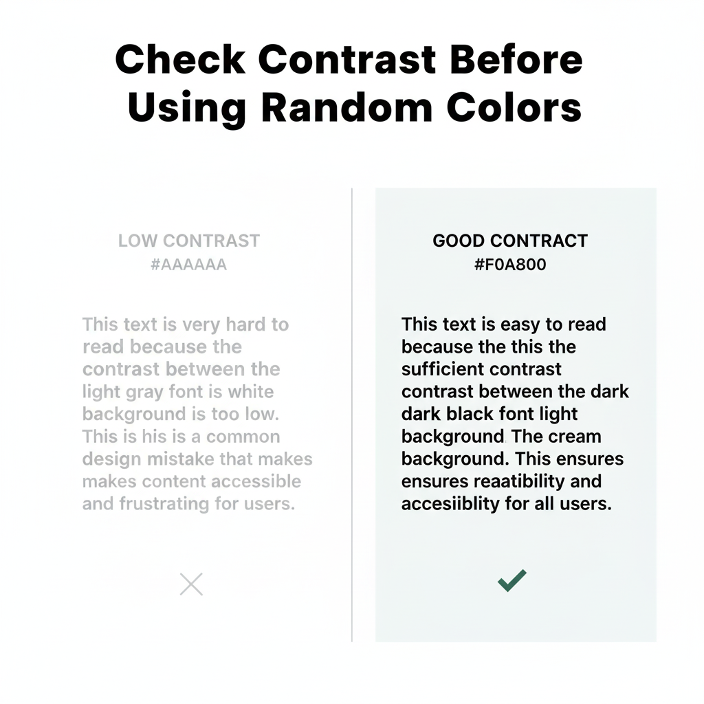
Mistake #4: Ignoring Accessibility & Contrast
Design isn’t just about beauty it’s about usability. Many color palette design mistakes happen when accessibility is ignored. Low contrast between text and background makes reading difficult, especially for users with visual impairments.
Fix it:
Use online contrast checkers or accessibility tools to ensure readability. Your random color generator may give you creative options, but always validate them for contrast compliance (WCAG standards). Accessibility-friendly design improves both user experience and SEO.
Mistake #5: Random Colors Without Hierarchy
Visual hierarchy helps users understand what’s important on a page. Without it, even a beautiful color scheme feels cluttered. A common design mistake using random colors is when every section, button, or element has a different tone, leaving no clear focus.
Fix it:
Use a consistent pattern: primary color for key actions, secondary for support, and neutral tones for background. Random color generation can still be useful, but structure your color roles before applying them.
Mistake #6: Forgetting Emotional Psychology
Colors evoke emotions. Blue builds trust, red creates urgency, green signifies growth. Using random colors without understanding color psychology can make your design emotionally inconsistent. For instance, using cold tones for a children’s brand might feel dull, while excessive red for a meditation app can feel stressful.
Fix it:
Before using random hues, ask: “What emotion should this page convey?” Even when using a random color generator, select colors that emotionally match your content.
Mistake #7: Poor Contrast in UI Elements
Another frequent UI/UX color design mistake is lack of contrast between elements, especially in navigation bars, buttons, or cards. Randomly generated colors may blend too much, confusing users about where to click.
Fix it:
Always ensure actionable elements stand out. Use bold colors sparingly for CTAs and maintain consistent spacing. Random colors can inspire you, but selective application keeps your interface intuitive.
Mistake #8: Mixing Too Many Colors
Using every color from a random palette makes your design chaotic. Remember: minimalism speaks louder. Too many tones create distraction and break visual rhythm.
Fix it:
Limit yourself to 3–5 main colors. If you use a random color generator, lock the colors that fit your theme and discard the rest. This keeps the design neat and modern.
Mistake #9: Not Testing Colors on Different Screens
Colors can look dramatically different across devices, what’s soft beige on your laptop might appear pinkish on mobile. Relying blindly on random colors without cross-testing leads to inconsistent user experiences.
Fix it:
Preview your design on multiple screens before finalizing. Adjust brightness and saturation for consistent results everywhere.
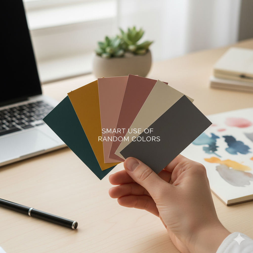
💡 How to Use Random Colors the Right Way
Random colors aren’t bad, unplanned use is. When used with intention, they add freshness and creativity. The Random Color Generator tool from Random Generator Labs can be a smart way to experiment safely.
Here’s how:
- Generate multiple random colors.
- Select 3–5 that feel balanced.
- Apply them using color theory and brand context.
- Test accessibility and hierarchy.
By following this structured approach, you turn randomness into controlled creativity, avoiding all the design mistakes using random colors we discussed above.
❓FAQs – Design Mistakes Using Random Colors
1. What are the most common design mistakes using random colors?
The most common design mistakes using random colors include ignoring color harmony, poor contrast, mixing too many hues, and choosing colors that don’t fit the brand identity. Random colors without a clear purpose often lead to cluttered and confusing visuals.
2. How can I fix bad color combinations in my design?
To fix bad color combinations, start by applying basic color theory، use complementary or analogous schemes, maintain contrast, and test your design on different devices. A random color generator can help you find balanced tones when used intentionally.
3. Is it okay to use random colors in professional web design?
Yes, but with structure. Random colors can spark creativity, but you must control them with purpose. Always consider your brand tone, target audience, and emotional goals. Avoiding design mistakes using random colors means balancing experimentation with consistency.
4. How do I choose the right color palette for my website?
Use tools like a random color generator to explore possibilities, then refine your palette by keeping 3–5 colors that align with your brand message. Ensure proper contrast and accessibility so your colors look consistent across devices.
5. What’s the best way to test color contrast and accessibility?
You can use online contrast checkers or browser plugins to ensure readability. High contrast between text and background improves both user experience and SEO. Testing helps prevent UI/UX color design mistakes that make your site hard to navigate.
🧭 Final Thoughts
Designing with random colors can be exciting but risky. The trick lies in balancing spontaneity with structure. Each hue should serve a purpose, guiding users, reflecting brand personality, or creating emotional impact.
Avoiding design mistakes using random colors will not only make your website visually appealing but also more user-friendly, consistent, and professional. Remember, good design isn’t about how many colors you use, it’s about how intelligently you use them.
So next time you experiment with palettes, open the Random Color Generator and start creating designs that are colorful and cohesive.
💡 Explore Your Next Random Color Palette
Ready to build your own minimalist color scheme? Use our free Random Color Generator and find the perfect tones for your next project.
Open Tool →