Discover the psychology of color in web design and learn how different colors affect user perception, behavior, and conversion rates. Find the best color combinations for your website today!w
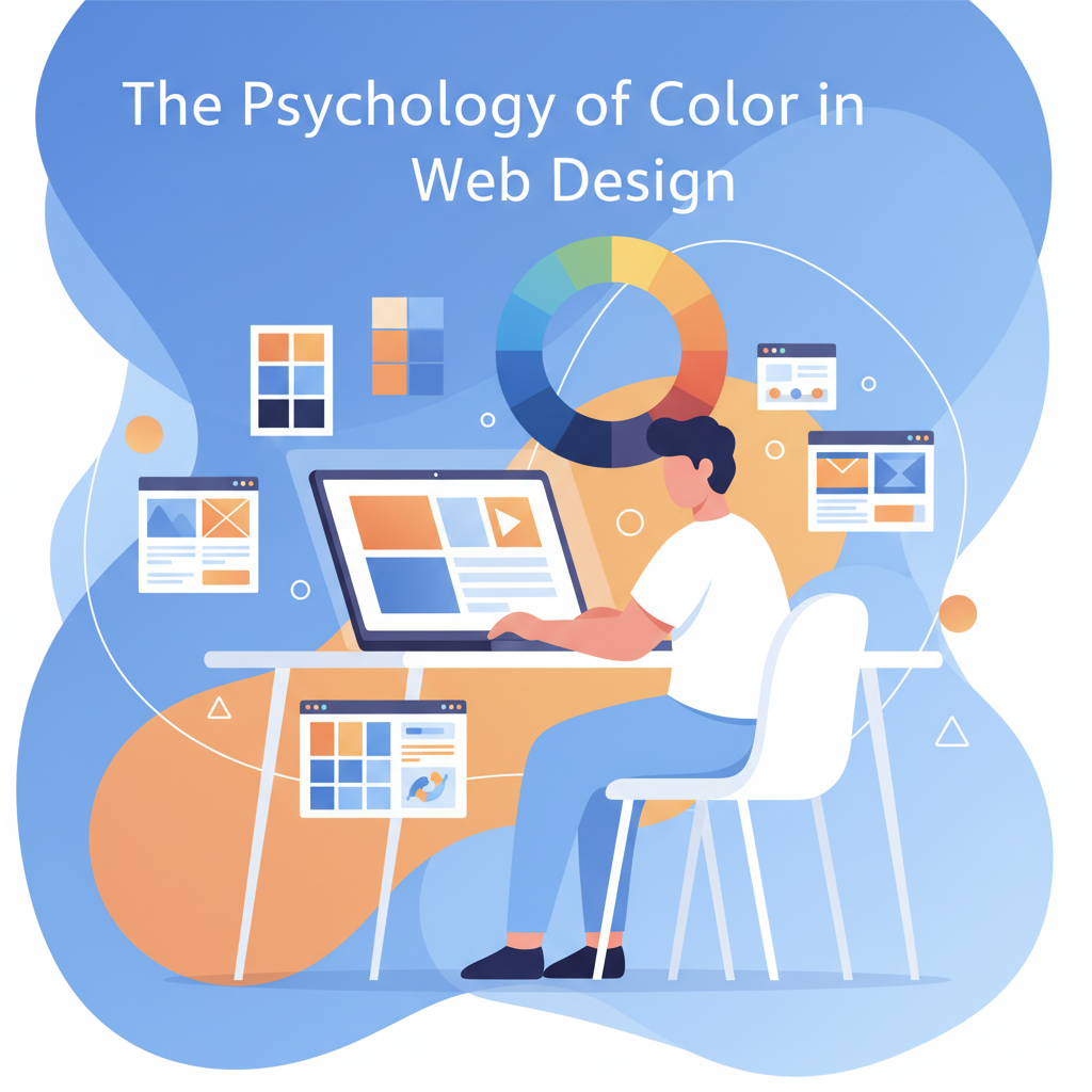
🌈 The Psychology of Color in Web Design
Colors are more than just decoration, they’re powerful psychological tools that can influence how visitors feel, think, and act on your website. Whether it’s the calming blue of Facebook or the energetic red of Coca-Cola, every successful brand uses color psychology strategically to shape user perception.
In web design, understanding the psychology of color can help you build trust, highlight key elements, and boost conversions. Let’s explore how color impacts design decisions, user emotions, and brand identity.
🎨 What Is Color Psychology in Web Design?
Color psychology in web design is the study of how colors influence human emotions, behavior, and decision-making. Every color has a unique psychological effect, some create excitement, while others build calmness or trust.
When a user lands on your website, they subconsciously interpret your color choices within seconds. A poor color palette can cause confusion or distraction, while a well-balanced one keeps visitors engaged and guides them toward the desired action, like signing up or making a purchase.
In short, color isn’t just design, it’s communication.

🧠 The Emotional Meaning of Common Colors
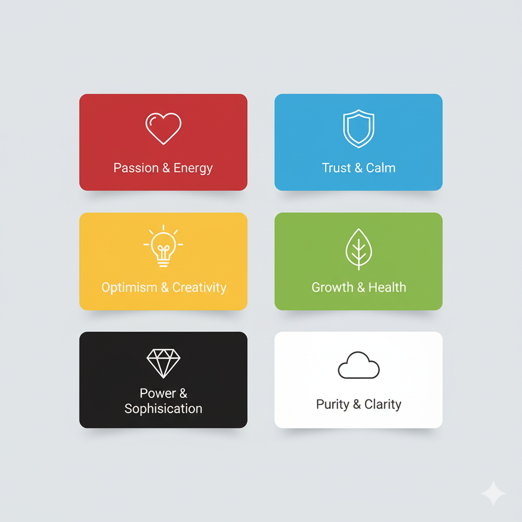
Choosing the right color palette for your website starts with understanding what each color represents. Here’s a quick breakdown of what emotions different colors can evoke:
| Color | Emotion / Meaning | Common Uses in Web Design |
|---|---|---|
| 🔴 Red | Passion, urgency, excitement | Sale banners, call-to-action buttons |
| 🔵 Blue | Trust, calmness, professionalism | Corporate websites, financial apps |
| 🟢 Green | Growth, nature, balance | Health, environment, finance websites |
| 🟡 Yellow | Happiness, optimism, warmth | Youth brands, creative agencies |
| ⚫ Black | Power, luxury, sophistication | High-end fashion, luxury brands |
| ⚪ White | Simplicity, purity, clarity | Minimalist websites, tech designs |
| 🟣 Purple | Creativity, wisdom, spirituality | Beauty, education, or premium brands |
| 🟠 Orange | Energy, enthusiasm, friendliness | Entertainment, marketing, or startup sites |
Each color triggers a specific emotional response, so using the right mix can shape the way users perceive your brand.
🎯 How to Choose the Right Color Palette for Your Websit
Selecting colors isn’t just about aesthetics, it’s about aligning colors with brand personality and target audience. Here are some practical tips to help you choose effectively:
1. Understand Your Brand Identity
Before picking any color, define what your brand stands for. Are you energetic and bold, or calm and professional? For example:
- A tech startup might use blue for reliability.
- A creative agency may prefer orange or purple to express innovation.
2. Use the 60-30-10 Rule
This design rule ensures balance:
- 60% of a dominant color (background/base)
- 30% of a secondary color (support elements)
- 10% of an accent color (buttons, highlights, CTAs)
This creates visual harmony and keeps your website easy on the eyes.
3. Focus on Contrast and Accessibility
High contrast improves readability and ensures users with color blindness can navigate easily. Always check text contrast ratios for accessibility compliance (WCAG standards).
4. Highlight CTAs with Strong Colors
Call-to-Action buttons should stand out. For instance:
- Red or orange CTAs create urgency.
- Blue or green CTAs convey trust and safety.
5. Test and Optimize
Run A/B tests to find which color schemes generate the highest engagement or conversions. Even a small tweak can impact user behavior.
💡 Color Psychology in UI/UX Design
In UI/UX design, color psychology helps direct user focus and simplify navigation. Smart designers use colors not just for branding but also to enhance usability.
Here’s how colors improve user experience:
- Navigation clarity: Colors highlight interactive elements like buttons and links.
- Visual hierarchy: Bright colors draw attention to key sections (e.g., signup forms).
- Emotional flow: Cool tones like blue make users feel safe, while warm tones like orange encourage action.
A consistent color palette builds familiarity and trust, making users feel comfortable exploring your site.
🌈 Experiment with Colors That Inspire
Turn color psychology into creativity! Generate random color palettes and craft visuals that connect emotionally.
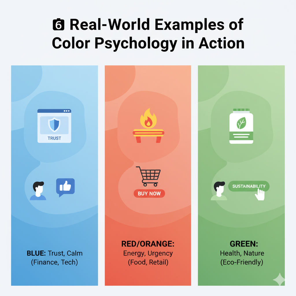
🎨 Try Random Color Generator💼 Real-World Examples of Color Psychology in Action
Let’s look at some popular brands that mastered color psychology:
- Facebook (Blue): Promotes trust, calmness, and communication, ideal for a social platform.
- Coca-Cola (Red): Evokes energy, excitement, and urgency, perfect for a fun, dynamic product.
- Spotify (Green): Symbolizes growth and creativity, matching their mission of sharing music freely.
- Apple (White & Gray): Reflects simplicity and innovation, clean, premium, and user-friendly.
Each of these brands uses color as a psychological anchor to influence how people feel when interacting with them.
🔍 Importance of Color in Website Design
Colors influence brand recognition, emotional connection, and user decisions. According to research, 90% of first impressions are based on visual factors, mainly color.
Good color design helps:
- Build instant brand identity
- Guide user flow and action
- Increase readability and retention
- Improve conversion rates
Ignoring color psychology can make your website look inconsistent or confusing, leading to high bounce rates.
🧩 Putting It All Together
The psychology of color in web design isn’t just theory, it’s a practical tool for improving engagement and conversions. By combining color psychology with UI/UX principles, you can create designs that connect emotionally, communicate effectively, and convert consistently.
Your color palette speaks before your content does. So choose wisely, test thoroughly, and make sure your colors tell the right story for your brand.
❓FAQs
1. Why is color psychology important in web design?
Because it influences how users perceive your brand and whether they take desired actions like clicking or purchasing.
2. Which colors are best for conversions?
Warm colors like red, orange, and yellow often drive action, while blue and green build trust. The best choice depends on your audience.
3. How can I pick the right color palette for my website?
Start with your brand personality, choose a primary base color, then add complementary tones using the 60-30-10 rule.
4. Does color affect website trust and readability?
Yes, poor contrast or inconsistent colors can make content hard to read and lower trust.
5. Should I use the same colors across all pages?
Absolutely. Consistency builds recognition and helps users feel comfortable navigating your site.
🔗 Related Posts
- 🎨 How to Generate Random Colors for Your Website Instantly
- 🌈 The Psychology of Color in Web Design
- 💡 Best Random Color Palettes for Minimalist Websites
- ⚙️ How to Choose the Perfect Color Palette for Your Website
- 🧠 Design Mistakes to Avoid When Using Random Colors
Final Thought
Colors speak louder than words. In web design, they shape emotions, guide actions, and build trust, all before a user reads a single line of text. Choose colors that reflect your brand’s personality, connect with your audience, and make your website not just seen, but felt.